Make nice looking RPG maps easily.
RPG Map is a tabletop oriented map editor
with the “keep it clean & simple“ philosophy in mind.
About
RPG Map is a tool I’ve built to make maps for my tabletop RPG sessions, with my friends. It’s born from the fact that most existing tools were either looking bad or were simply overly complex to use.
My approach is to make an easy to use tool to create beautiful maps quickly.
You can still access the old Flash-based version (source code available on GitHub)
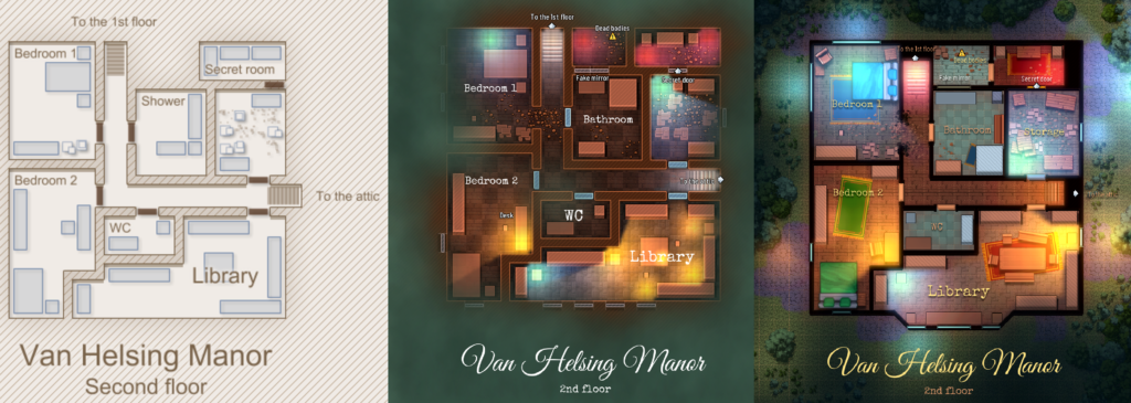
Commercial use
RPG Map II is completely free to use. All the content you create with it can be used any way you want, including in commercial products.
Features
- Full HTML5 support, Windows version on Itch.io
- Roll20 and Fantasy Grounds exports
- Import your own images or icons
- Fully customizable colors
- Import maps generated by One Page Dungeon (from Watabou)
- Support for special walls, such as caverns, diagonals, etc.
- Ground textures
- Ray-casted lighting & fog
- Multiple skins and many customizable colors
- Texts, numbered elements with automatic legend block generation, text bubbles…
- Icons
- Enemies
- User friendly UI
- Pay what you want, including free!
Hello, I really like your tool and to someone like me who doesn't really have the artistic ability to hand-draw my own maps, this tool is a godsend! I'm still learning how to use the tool but this is the first map (an interior of a large ship) I've made which I used as a base for using in a sci-fi game on Roll20.
https://i.imgur.com/JmPeEDp.png
I like to make large maps but I often lose count of how big certain chambers are and with large maps like that one, it's difficult to count manually. Do you have plans to add a ruler tool or a way to measure how many squares are in a certain area? Or does that already exist in the tool and I missed it?
Incoming bigpost.
Interestingly, I actually used much of the same trick that Tanaka showed off, of using rubble to indicate cliff walls. I always thought that the extra apparent thickness looked a lot nicer for contrast between a manufactured wall and a natural one. But the real idea behind it is simply making the walls more visually obvious, isn't it? I've been drawing my own map tilesets for a while now, so I can illustrate the idea.
https://i.imgur.com/wPsGmyK.png
The initial idea behind this set was to copy the appearance of early black-on-white maps, but it quickly shifted to something closer to watercolor due to the limitations of TileD (the map-editing tool I was using, which was never intended for tabletop map design and is actually a game development tool).
Anyways, the first set of walls I made as a "prototype" to test the style out before investing a lot of time into drawing additional wall sets, items, etc. was the brick walls at the top. They turned out fantastically, but after some additional testing and work what I learned was that I had actually made them *too thin*. At the scale I was working at, at 100% zoom, they didn't stand out enough because the brick walls were only three or four extra pixels on one side. It was marginally improved later when I added the fake shadows (the common grey part on all of the wall segments) but remained a stylistic problem anyways.
I made the lower set of thick crypt walls as a reaction to that, followed by the cave walls. The crypt walls were much thicker and designed explicitly to visually differentiate internal areas from external. They *looked* like solid walls because they're a quarter of the thickness of a tile. The cavern walls were also a significant improvement.
Which brings me back to the reason why I painted big rocks over the walls in ANAmap, and why I like ANAmap's artistic style more than RPG map's.
https://i.imgur.com/phcQXKq.png
Big rocks are used in two ways here. They mark the borders of any rock walls in the area with a thick line of unbroken rock. This provides the pleasing contrast between natural walls and artificial walls that seems to be common. I've used it in a second way by painting in much of the gaps around the map *behind* artificial walls. This gives the impression that all the material that cannot be seen is, in fact, rock, moreso by painting specifically along the borders of artificial walls and in internal areas.
I don't think that simply allowing rubble to be painted over walls is a good solution, because RPG map's rubble does not have the appearance required to achieve the same effect. It is smaller, does not cross borders reliably, and would not properly cover the wall line. It is also technically a hack job, but I guess that's desirable in a map editor intended to be simple. I kinda feel like RPG map actually drifted too far from the symbolism that made ANAmap so flexible for stuff like this.
Finally, two more small observations about the walls: the wall borders were actually twice as thick in ANAmap as they are in here. A single-pixel line on a 32x32p tile is half the width of a single-pixel line on a 16x16p tile. Also, ANAmap's walls were significantly lower contrast with the terrain than any of RPG map's styles, and had a dark outline for walls instead of a light one. I feel like using a dark outline made it look more like a traditionally drawn map, something that's missing in RPG map.
The update 13 should come closer to what you described, I hope you'll like it :)
Je suis très d’accord avec Tanaka. Le fait de pouvoir mettre les big-dirt dans les murs était aussi une fonctionnalité que moi comme les autres MJ’s twinoïd utilisions. Mais les nouveaux gravats ne permettent pas cette possibilité. Après bon, les cavern-walls remplacent cette fonction, mais en terme de superposition, le fait de pouvoir mettre une porte DANS un mur restait un super moyen d’illustrer des passages secrets, et autres choses de ce style.
J’ai cependant une question, du au fait que c’est quand même un super freeware que tu proposes : créer et bosser sur cet éditeur de map, ça te prend combien de temps, en moyenne ?
Pour les passages secrets, vous pouvez utiliser les fenêtres qui sont faites pour s'inscrire dans un mur justement. Pour les gravas, je vais voir ce que je peux faire pour autoriser leur usage sur les murs occasionnellement.
Pour ce qui est du temps passé, pas beaucoup au final. J'y ai travaillé activement pas mal de soirs et week-ends pendant 2 mois pour la première release d'avril à juin. Maintenant, j'y passe quelques heures par ci par là, en fonction de mes dispos :)
And it's also very glitchy.
This is pretty frustrating when trying to make the outside of structures, otherwise, it's good for other things.
Hi!
I am a Japanese user. Your tool is great, it saves me a lot of time! But ANAmap used random procedural textures for lots of stuff like rubble and trees, and RPG Map II does not.
https://i.postimg.cc/fyLw7p0C/flash-player-2019-11-18-21-00-03.png
BigDirt and SmallDirt are procedural. I think trees are too, and crates are random in placement. BigDirt sticks out across grid boundaries, which is really great for outlining rough walls like the image. I do that a lot because it makes walls look really thick and nice, like a solid border. But RPG map rubble repeats its textures and can't be painted over walls, and it also gets a lot thicker when it borders two other rubble tiles which is hard to work around, and cavern walls are just a thin rough line. They don't pop like ANAmap. And crates repeat their textures a lot too. From your smuggler example:
https://i.postimg.cc/3w8bwv0M/repeating-crate-texture.png
Why do you not use random procedural textures anymore? Are you planning to? I would like something that lets me make walls as rough looking as my ANAmap image again…
Hi! Thanks a lot for this interesting feedback. I gave up procedural generation for performance issues mostly: drawing on-the-fly all the items was really expensive.
But I plan to add much more variations to all elements, such as crates or dirt to make sure you don't see repetition too much. I will also try to fix the "automatic small/big dirt" issue you're pointing at, as I also think it's a problem (which is easy to fix actually).
This is a lovely map tool you have made, thank you very much for your hard work.
Will there be add ons such as new map tiles and what not?
Thanks! Sure, I've lots of new content planned, mostly new textures and items.
I'm trying to make some science-fiction horror maps for a couple of one-off games.
https://i.imgur.com/Bnnvzh9.jpg
It's a space station overrun by a Zerg-like species — the game itself is closer to Alien: Isolation. The black and white theme is by far and away the best for the game mood, but I'm having some problems — the fog is actually not great for dark areas, because it's on a far larger grid and bleeds through walls, and I don't have a good way of differentiating between solid platforms and space, because the terrain blends weirdly and organically and none of it is suitable for a space station. Black and white also prevents me from using colors like bright red emergency lights, and the blueprint theme just isn't nearly as spooky as I'd like.
Also, the to-do list still mentions water and lava pools.
I see the problem here, but it's not easy to fix, as it's deeply related to the way I draw the ground textures. Not sure I can change that, but I'll have a look! As of the color theme, I will probably add a spooky "almost" black & white theme in a future version.
En effet, c’est un problème de réseau. J’ai utilisé la version windows et après un petit temps de chargement, j’ai pu obtenir la carte en jpeg, haute qualité de lumière, etc. Mais comme dit voilà, c’est un problème que j’ai avec toutes les cartes un peu grosses et surtout pleines de lumières.
En attendant, voici le JSON de la carte, que j’ai mis sur drive : https://drive.google.com/open?id=1QnHYXoHTMRB4kx3uWlMCUQleucXXEF2x
S’il n’est pas possible de dl le json, je le réuploaderai autrement.
Merci beaucoup :)
La vache si on peut importer des icônes ou des objet, cet éditeur de map va devenir une véritable machine de guerre.
En attendant je crois que j’ai un bug à signaler, m’enfin j’suis pas trop trop sûr. En bref je suis du genre à faire des maps de grandes taille dont voici un exemple : https://drive.google.com/file/d/1wqONsZ_zJApis5CNrXOknNl1X8YRsGvn/view
Le truc, c’est qu’il m’est… impossible de les télécharger. J’ai beau diminuer la qualité des lumières, le télécharger en 50%, en jpeg, etc, pas moyen : dès qu’une map a trop de lumières, le soft freeze et je télécharge un fichier random avec pour titre "échec téléchargement réseau". Cela doit être dû à ma connexion. En attendant, je suis résolu à devoir faire des impressions d’écran comme ici, et comme on peut le voir sur l’image, eh bien dans les screen y’a ces "ronds" qui déterminent l’emplacement des lumières lors du mapping. Au tout début, sur les premières version de la V2 de cet éditeur de map, ça n’y était pas. Je sais que ça sert à savoir précisément sur quelle tuile on a mis la lumière, mais comme je pense peut-être ne pas être le seul à faire des impressions d’écran, avoir un moyen de désactiver ces ronds pourrait être chouette.
S’il y a un besoin de faire un screen des trucs que je télécharge avec les messages d’erreur, je ferai ça prochainement.
Voili voilou <3
C'est effectivement probablement un problème réseau. Pourriez-vous essayer en utilisant la version Windows à télécharger plutôt (https://deepnight.itch.io/tabletop-rpg-map-editor) ? Pourriez-vous également mettre le fichier JSON de la carte quelque part pour que je puisse le tester et isoler le problème ? Merci :)
I assume character sprites means new icons for enemies. Like the boss token. Do you mean by "play" mode that you intend on turning the program into a battlemap tool in addition to being a map editor?
Yes, that's something I was thinking about. But I don't plan to compete with Roll20, so that's not a guaranteed feature :)
Salut salut.
Comme dit, j’adore le nouveau map-maker, et tous les rôlistes que je connais commencent à l’utiliser par bouche à oreille. Il y a un boulot conséquent derrière ce soft, et le fait qu’il soit gratuit est toujours aussi hallucinant.
Cependant, je ne pense pas que le "play" mode soit une bonne idée : lorsqu’on télécharge une carte, c’est pour l’utiliser sur un logiciel comme Roll20, Fantasy Ground, Rolsteam, Rolistik, et j’en passe : ces logiciels et sites offrent des interfaces de lancers de dés, de fiches interactives, permettent l’import de milliers de pions, des lumières dynamiques… Donc encoder un play mode, je pense, est superfétatoire, ou dispensable. Ces sites le font déjà : cependant, ils ne permettent pas de réaliser des maps.
En revanche, un truc qui serait génial (ce ne sont vraiment que des suggestions), ce serait d’avoir de nouvelles tuiles : on a de l’herbe, de la pierre, des dalles, du bois, et le fond de base. Je pense qu’on gagnerait énormément en possibilités de maping avec de la neige, du béton, et autres variantes, qui permettraient de mettre en scène largement plus de lieux. Bref, plus de tuiles.
Au passage, l’ajout du brouillard reste vraiment un des meilleurs en terme de création d’atmosphère :]
Bref, des bisous, et en te remerciant déjà de ouf pour le travail accompli :]
Je suis assez d'accord que le but n'est pas de concurrencer un Roll20 :) C'est juste que pour "dérouler" une carte sans avoir à sortir l'arme lourde en terme de logiciel, il y a peut être un petit quelque chose à faire pour pas trop cher à réaliser. Mais c'est au stade de la réflection, je prends la température ;)
Les nouvelles textures sont prévues, avec également la possibilité d'importer de nouvelles icones et objets.
Do you plan to add an import feature for character sprites in a later version? (Love the program so far, keep up the great work!)
By character sprites, do you mean "new fonts"?
Is there a way to hide enemies showing over the fog?
No, but I'm planning to have a "play" mode where you will be able to reveal your map dynamically. So that will probable fit your needs, I guess :)
Hey hey! Checked back in again after ages. Coming along GREAT man! Some really cool additions since the GM Screen update. I'm hoping to get a lot more free time after this month, and I'll be making some new maps for a homebrew campaign I've been wanting to run for months now. Hopefully my map design abilities have kept up with the updates!
J’adore la nouvelle lumière verte.
Sorry for the delay!! Yes, I can confirm your newest version worked like a charm. Kudos!
I'm impressed. I'm genuinely impressed. I had written off the earlier versions as fascinating but not useful, since I didn't like the style much, but the new black and white appearance with the adddition of fog and lighting, plus checkerboards, has *dramatically* improved the maps to the point where I want to start a Delta Green or Halloween game just to utilize them properly. The blueprint appearance is dramatically improved when the grid is changed to white, too — it looks like a real blueprint.
https://i.imgur.com/tr4g5SE.png
Minor post-processing added, of course.
Will you add arbitrary wall/furniture and light colors in the future, or will the program stick to a simple theme-based setup?
Gotta say i'm a huge fan of your app. Used the old version quite a bit, and the new one seems to be coming along great.
A small feature request: A "ruler" tool, that allows you to click+drag to measure how many grid units are in an area. Would be useful when thinking about how the size of a map might play into a combat encounter. Thanks for developing this great app.
That's a nice idea, I will take note :)
New version is awesome. I love the old one still too for it's simplicity but you've rebuilt it very well. You are a legend my friend, thank you for putting your time into helping others out!